What the old site got right
It felt personal, obviously handmade, and worth preserving instead of pretending it never existed.
Before the rebuild, kept on purpose
The old site had warmth, personality, and obvious hand-built energy. The current site is sharper, more recruiter-readable, and much better at showing outcomes, current builds, and where the fit is strongest.
The page around it now uses the current George layout language, but the screenshot itself stays intact as the preserved before-state.
It felt personal, obviously handmade, and worth preserving instead of pretending it never existed.
It did not explain the work fast enough, and the strongest proof sat too far down the page.
The contrast makes the rebuild feel real. The newer site is not just different visually. It is more useful.
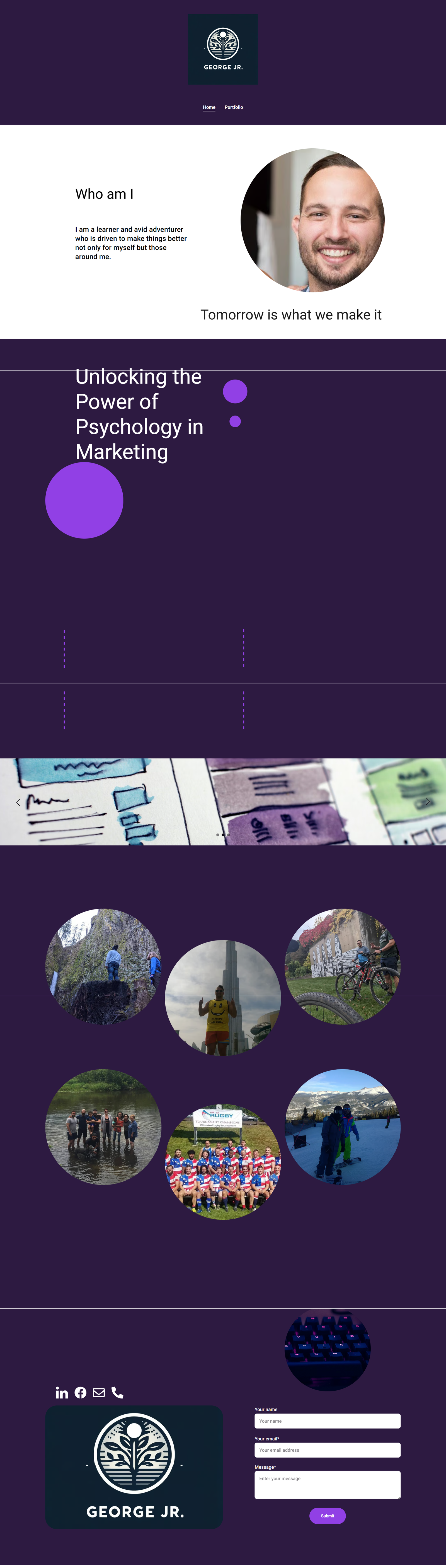
This is the actual earlier homepage that came before the current recruiter-focused portfolio.
It worked more like a personal introduction than a clear working portfolio. The rebuild kept the human signal but moved the strongest proof much closer to the top.
The newer site is stronger because it is easier to scan, more proof-led, and more useful for the kinds of roles this portfolio is meant to support.
The old homepage felt human, but the story was too loose to carry the hiring message on its own.
The rebuild works better because current builds, outcomes, and role fit appear much closer to the top.
The point was not to fake credibility. It was to organize real work faster and ship a clearer portfolio.
This archive preserves the before-state. The main site is where current builds, selected proof, and role-fit information live now.